Google Analytics Is Re-Launched: Do These Five Things First In V2

Version 2 is so radically different and provides such a compelling value proposition to users of web analytics that I am excited to write a blog post about a product (the first time I have done this in 11 months of existence of this blog).
I am also the Analytics Evangelist for Google but you’ll see that I am so excited about GA V2 not because I consult for Google but because I believe that v2 is a leap forward for all of its current users and a new standard for the industry when it comes to interacting complex web analytics data. Please share with me what you think, at the end of this post.
Also while this post is about GA V2 it contains examples of the best practices I have talked about on this blog frequently, I have just tried to do those with GA here. So if you use Omniture or WebTrends or WebSideStory or HBX or Visual Sciences or ClickTracks or indexTools or NetInsight or any other piece of web analytics software (and care only a little about GA) you’ll still find tangible examples of analysis you can do to find actionable insights. You can follow along and replicate these with your web analytics tool.
Here are the five things you should do the first time you log into GA V2:
Summary:
- Notice the awesome new data interaction model.
- Take the enhanced “data discoverability” for a spin.
- Context is king! Find your context quickly.
- Ahh…. Segmentation is just a step away.
- Upgraded goodies: Schedule and email any report or dashboards, Better site overlay, Much nicer page level reporting and more.
Details:
# 1: Notice the awesome new data interaction model.
One more of most dramatic changes to Google Analytics V2 is the new immersive data interaction model. It sets a new benchmark for how users interact with data. It shifts the model from a few digging long and hard to find insights to the many not having to dig a lot to find first blush insights and also having the power to easily and quickly dig deeper if they want to.
The V2 UI is completely new and the center piece of this launch. Every where from totally customizable dashboards to the overview reports to the presentation of the data and more “stories” that go with the reports now. The tool is easier to use, key metrics jump out to you and it is ever more easy to understand what is going one (if only all sexiness in the world was so productive! : )).
Here’s the new dashboard (notice the use of colors, font, content groupings etc in service of quickly communicating with you):

All images in this post are linked to slightly higher resolution images, go ahead and click on all the images . The screenshots represent real data for this blog.
Here is the new presentation of the split between New vs. Returning visitors (notice the small “story” under the graph, the use of colors and layout of the table, and a quick and easy way view that communicates not just what happened last month but also a eye catching graph that tells us “performance” vs site average):

As you’ll use the tool you’ll see more and more examples of effective communication of data via a very well thought out UI that is perhaps the best one today amongst all web analytics tools.
People underestimate the value of being pretty. Our world of web analytics is already too complex and data is hard to parse and insights harder still to get. Effective presentation of data (ok pretty!) is greatly accretive to helping understand trends and insights and significantly increase ease of use both for a lay person and the super analyst.
# 2: Take the enhanced “data discoverability” for a spin.
It is both a blessing and a curse that there so much data that we have access to. It means both that we can track and report a lot but it also means that it is a non-trivial challenge to find all the metrics/pieces of data you need to find the nuggets of actionable insights.
The new version of Google Analytics does a great job of addressing this challenge by immensely improving, what I call, data discoverability. The key data you need is not hidden sixteen clicks away. Most of it has been surfaced so that it is staring at you already or you can find it in two clicks.
For example look at the Visitors Overview (click Visitors on the left navigation in GA):

Notice that not only do you get a trend of the Visitors to the site but you can also get all your key metrics in one “page view”. Further more the next action is within easy reach, either click on one of the many metrics you see under the graph or there are Visitor Segmentation options being suggested to you. You quickly get the whole story but you also learn what else is there.
Did you notice the lovely sparklines? Somewhere Edward Tufte is smiling. :)
Here’s another example. I am deeper into my reports and want to see where my traffic is coming from. Easy report from any tool (and a report you should constantly look at).

On one page you have three interesting ways to discover data (and find insights):
1) You can easily switch the “master metric trend” to one of the other metrics (and get a quick glimpse of the performance of your referring sites).
2) You can easily switch between “standard metrics” to “bottom-line metrics” (Conversion). Compare image below to image above, one click access to clickstream (behavior) and outcomes.

3) Oh your standard metrics are always there, even though you were looking for Visits, to prompt you to dig deeper (notice that Visits are doing ok but something happened in May that caused a increase in content consumption - pages/visit and time on site - and caused lowered bounce rates).
As you use the tool you’ll find many little and big ways in which the new UI makes it easier for you to drill down, drill up and drill around.
# 3 Context is king! Find your context quickly.
On this blog we have highlighted the importance of having relevant context to helping you make optimal decisions. The recent how should analysts spend their day post indicated that 20% of the time should be dedicated to staying plugged into the context.
The new version of Google Analytics provides several features that help you get relevant context to the performance of your website metrics. I think both of these make it significantly easier for novices and experts to understand their data (which might lead to more insights). Let me share a couple of examples……
In my emetrics presentations I have talked about how key metrics are often “lonely” and need friends to highlight important opportunities and occurrences. No matter where you go in the new Google Analytics your metrics won’t be “lonely”, you won’t find too many reports where you only look at one metric by itself. Lots of thought has been put into showing key metrics in context.
Here is a example, I am looking for the conversion rate for the last month and sure enough it is easy to fine (click on traffic sources, then Keywords, then switch Visits for the graph into Goal Conversion Rate):

Now notice something cool, not only do you have a trend for conversion rate on your website but in the Site Usage area of your report you can see your key metrics for the Search Traffic (numbers in bold black) but, this is fun, notice that you can also see (in smaller grey font) the comparison of your search metrics with your Site Metrics. You easily get important context such as “the % of new visitors is higher for search but their site page views per visit is lower”. Often we buy into the hype of search engines because we might only look at one metric or the other, now you can get the whole picture, quickly.
And you don’t lose that valuable context as you drill down, in this case I drill down to looking at the Conversion Rate for the top keyword from search engines:

Even at a quick glance I know exactly how this keyword is performing, not just for Conversion Rate but all other important metrics (this is the top performing keyword but only contributes 1.41% of the site visits!).
Also data discoverability continues to be enhanced, notice right under the keyword are options to see performance for Total, Paid (PPC / SEM) and Non-Paid (Organic - SEO). You never have to leave the “page” to do all this.
But perhaps one of the easiest way for you to get context about your performance is to simply compare it to a, well, comparable time period. With Version 2 this is easier than ever. You still have to boring calendar you can choose your time periods from, but what I like better is the new Timeline feature where I have the option to using two slides and drag them to choose my date range. Very efficient…..
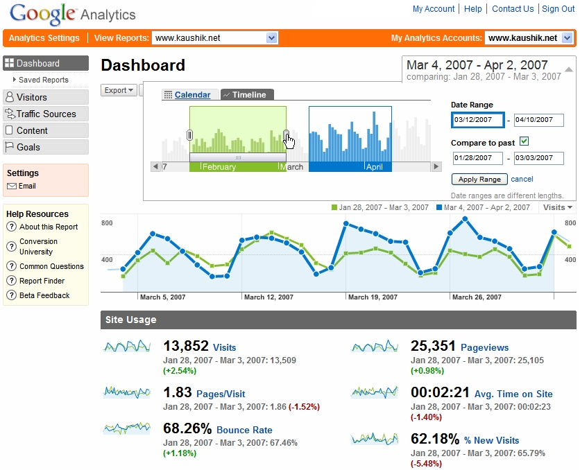
As soon as I hit Apply Range I can see at a glance trend of the main metric I was looking at for the two time periods (Visits) but notice the changes for all other metrics. My sparkline trends now show the two time periods. I also have automated raw numbers for my key metrics and in helpful Red and Green indicators how each metric has performed over those two time periods.
Again in this case you can understand your performance better and even at this high level the questions you should now ask of your data will bubble up.
The nice thing is that once you choose your timeline for comparison in any report, that comparison then permeates all your reports so that you can start at a high level and drill down and still have the valuable context. Here for example is a drill down to sources of traffic to the site where I find the same timeline comparison…….

You can hover your mouse on the timeline to get daily performance, or you can easily look at the deltas for the key metrics (click on the image above to see how the context continues for your top sources and keywords, all on the same page - remember the goal is for you not to dig around to get actionable insights).
# 4: Ahh…. Segmentation is just a step away.
Most of the reports you’ll see in Version 2 of Google Analytics provide easy access to segmentation options. For example in this report while looking at the Direct Traffic you can simply click on arrow next to Segment and you can see lots of segmentation options (including by some Value that you can define and pass to GA):

And here is another example for when you are deep in the bowels of doing your long term analysis you can quickly see how these options (in a composite image) would be very helpful:
# 5: Upgraded goodies: Schedule and email reports/dashboards, Better site overlay, Much nicer page level reporting and more.
You now have a very convenient to share your analysis / insights with a wider group of people in your organization. Just select any report (even ones you have segmented and timeline compared etc) and click the Email button…..

As you can see above you have the ability to write a custom message, choose a convenient format (including extremely high resolution PDF’s) and the schedule.
Site overlay gets a v2 upgrade as well, notice something new…..

The site overlay report not only opens in a new window (where you can simply “surf your site”) but on the top you see a new “navigational bar” that allows you to switch your choices of what you want your site overlay to display. In the screen shot above that Clicks, Goal Value (How much is each link driven in terms of goal revenue), Goals 1 and 2 (click density for driving to conversion goals that you have set for your website). You can now visually get a great picture of how each page is performing.
Site overlay is one of the most underutilized reports of any tool, with v2 it gets better in Google Analytics and builds a foundation for future enhancements.
Page level analysis has also gotten easier and much better in V2. As you’ll see in the screenshot below you can choose the page you want and then look at a detailed summary or navigation summary or entrance paths to the page or external sources who referred traffic to a page or the keywords that drove traffic to a page from a search engine.

The Entrance Paths is particularly interesting. For example how many people came to the product page, where did they go next and of those how many ended up in the shopping cart and if not there then where did they end up? Good to understand and actionable (even though I am not a huge fan of site level path analysis, that is not a good use of time).
Novice users (or experienced users!) will find it very convenient to locate help and definitions throughout the application. Just click on the question mark icon next to any metric you see or the Conversion University link next to any report.

Let us all resolve never to get confused about Hits, Visits, Visitors and Unique Visitors!! : )
So what should you do now? Can’t let you get away without action items now:
- If you have used Google Analytics thus far then try the analysis above and give the new reports a spin, I guarantee that you’ll find the tool significantly easier to use and you’ll discover your own little and big trends faster.
- If you have never used Google Analytics before then now is a good time to try. It still comes free (sign up here) and you’ll see what a free tool can do that your current web analytics tool can’t. You may or may not decide to use cancel your current tool subscription, that is a very personal choice, but you’ll make that decision for a informed position.
Closing thought: Having been such a fan of Measure Map I am super impressed with what Jeff and his team have delivered, something that is a revolutionary step forward when it comes to complex web data and how we interact with that data in our quest to find insights. But I am a greed person and want a lot more! :) I am excited for the future possibilities of innovation and invention on top of this new platform.
What do you all think? Have you tried V2? Are you excited about what you have read above (if you made it this far)? Was this post by a Analytics Evangelist or a super excited web analytics geek/blogger? Please share your thoughts and feedback via comments, I would love to hear what you all have to say. Thanks.


